Split Screen Login Page Design for React
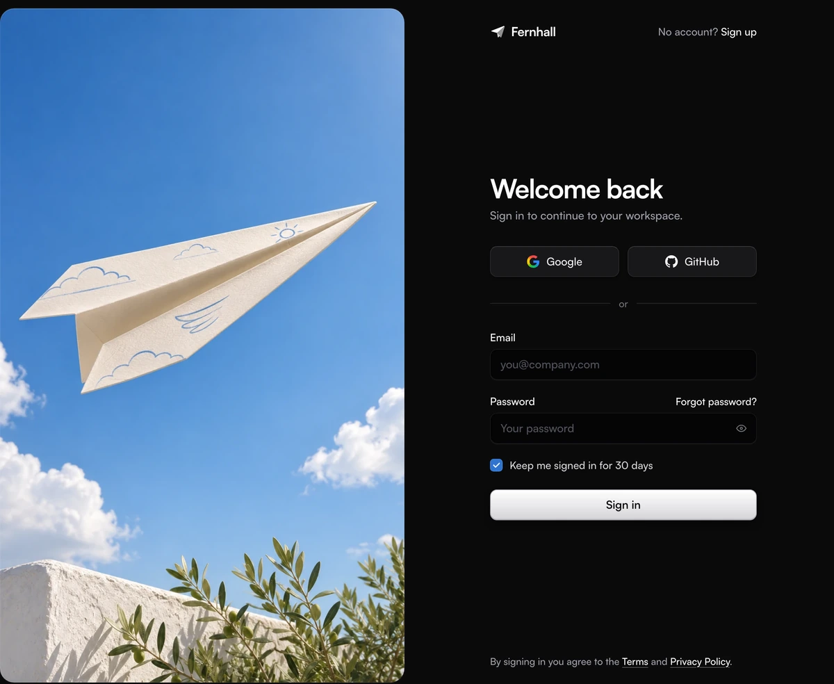
ProA sign in screen in two halves. On the left, a full height photograph sits in its own rounded frame, set in from the edge of the page. On the right, a narrow column holds the brand, a Sign up link, Google and GitHub buttons, an email and password form and the terms line. The form is wired for real use: it validates, shows a spinner while it waits, reports a failed attempt in words and hands the values to a function you write.
A login page design that splits the work in two
Login Page With Split Screen Image is a React and Tailwind CSS login page that pairs a sign in form with a full height picture, in Next.js or any React app. It is a whole screen rather than a card dropped into a layout, so it suits the route people land on when they press Sign in on your marketing site.
The split screen is the most common login page design for products that want the screen to feel like part of the brand. The form column stays plain and fast to read, and the picture column carries the mood that a bare form cannot. Because the two halves never overlap, the photograph can be as loud as you like without costing the form any contrast.
The shipped picture is a paper plane gliding through a clear blue sky above a white wall and olive branches: a calm image about getting somewhere, chosen to sit well beside both the white form in light mode and the near black form in dark mode. Swap it for your own photograph through one prop.
The parts of the split screen login page
Below the large breakpoint (1024px) the photo column is hidden and the form column fills the screen, centred, so phones and tablets get the form alone.
Header row
The brand mark, a folded paper plane drawn as inline SVG in the text colour, sits beside the brand name as one link. Opposite it, No account? Sign up. On narrow phones the No account words drop and only the link remains.
Heading and line
Welcome back, set large in the sans font with tight tracking, and one sentence under it. The heading renders as an h2 by default and takes headingAs when the login screen is the whole page.
Social sign in
Google and GitHub side by side as raised buttons with a lit top edge. Pass one provider and it fills the row; pass an empty array and the buttons and the or divider both disappear.
Email and password
Recessed fields that sit a step below the page surface. The password field has a show or hide button inside it, a Forgot password link beside its label and a Caps Lock warning that appears only while Caps Lock is on.
Remember me and submit
A custom checkbox, ticked by default, reading Keep me signed in for 30 days. Under it the Sign in button: graphite in light mode, brushed silver in dark mode, with Signing in and Signed in states.
Picture frame
The photo fills its column with object-fit cover inside a frame inset 12px from every edge (16px on wide screens) with 20px corners (24px wide). A hairline and a soft top highlight are drawn above the picture so its edge stays crisp on white and on black.
When a split screen login page is the right choice
Use it when
- Your sign in route is a page of its own and you want it to look like the rest of the brand rather than a default form.
- Most of your users arrive with a Google or GitHub account, so offering those first saves them a password.
- You have one strong photograph or illustration that reads at a tall crop, and nothing else to put beside the form.
- Your site has light and dark themes driven by a dark class, and the sign in screen has to follow them.
Skip it when
- You need the form inside a modal or a dropdown. This layout expects the whole viewport.
- Sign in happens through a magic link or a one time code only. The password field is built in, not optional.
- You need providers beyond Google and GitHub. The provider type has those two, and adding Apple or Microsoft means editing the source.
- Phone users are your main audience and the picture is the point. Below 1024px the photo column is hidden.
Connect the split screen login to your auth
The block owns its own form state, so you do not wire inputs one by one. It calls onSignIn with an object of email, password and remember once the email looks like an address and the password is not empty. Return a promise and the button shows Signing in until it settles. Throw an Error and its message appears above the button in a red alert, with the password selected so the person can retype it. Leave onSignIn unset and a demo runs instead, failing on purpose for any password under eight characters, so remember to pass your own before you ship.
Social buttons work the same way through onProviderSignIn, which receives google or github. A redirect based OAuth flow usually navigates away inside that call, and the pressed button keeps spinning until it does. After a successful sign in the button shows Signed in, then the form resets itself after 2.4 seconds in case your app has not navigated.
Brand, copy and links are props. The picture is the image prop, an object of src, alt and an optional object-position, so you can point it at your own photograph and keep the subject in frame as the column changes shape.
npx wensity@latest add login-page-with-split-screen-image --type block
import { LoginPageSplitScreenImage } from "@/components/wensity/blocks/login-page-with-split-screen-image";import { useRouter } from "next/navigation";import { authClient } from "@/lib/auth-client";export default function SignInPage() {const router = useRouter();return (<LoginPageSplitScreenImageheadingAs="h1"brandName="Acme"signUpHref="/sign-up"forgotPasswordHref="/forgot-password"termsHref="/terms"privacyHref="/privacy"image={{src: "/images/sign-in.webp",alt: "Our studio at golden hour",position: "50% 40%",}}onSignIn={async ({ email, password, remember }) => {const { error } = await authClient.signIn.email({ email, password, rememberMe: remember });if (error) throw new Error("That email and password don't match.");router.push("/dashboard");}}onProviderSignIn={(provider) => authClient.signIn.social({ provider })}/>);}
Props
| Prop | Type | Default | Description |
|---|---|---|---|
onSignIn | (values) => Promise<void> | void | - | Your email and password call. Throw an Error with a human sentence to show it above the button. |
onProviderSignIn | (provider) => Promise<void> | void | - | Starts the Google or GitHub flow. The pressed button spins and the others dim until it settles. |
providers | ("google" | "github")[] | ["google", "github"] | Order or trim the social buttons. An empty array removes them and the divider. |
image | { src; alt; position? } | paper plane photo | The picture column. Write a real alt text; position keeps the subject in frame at tall crops. |
brandName | string | "Fernhall" | The name beside the paper plane mark. Replace the mark itself in the file. |
heading | string | "Welcome back" | The large line. Keep it short enough for one line in a 380px column. |
signUpHref | string | "#" | Where the header Sign up link goes. forgotPasswordHref, termsHref and privacyHref sit beside it. |
headingAs | "h1" | "h2" | "h2" | Use h1 when the login screen is the page itself, which it usually is. |
Accessibility and what runs in the browser
No animation library
Everything is Tailwind classes and a little React state. The one runtime package is @tabler/icons-react for the eye, check and alert icons; the Google mark loads from assets.wensity.com and the GitHub mark is inline SVG.
Errors a screen reader hears
Each field links its error with aria-describedby and sets aria-invalid. A failed sign in renders as role alert, and a polite live region announces Signing in, Signed in and Connecting to Google or GitHub.
Focus stays where you left it
While a request runs the fields turn read only and the buttons set aria-disabled instead of disabled, so keyboard focus never jumps to the top of the page. An invalid submit moves focus to the first field that needs fixing.
Password managers
The email field uses autocomplete email and the password field uses current-password, so saved credentials fill in. The show password button keeps an aria-label that says what it will do next.
Reduced motion
Under prefers-reduced-motion the spinner stops turning, the photo appears without its 700ms fade and field transitions switch off. Nothing on the page animates in on load.
Light and dark
Every surface sets its own solid colour in each theme through the dark class, so nothing from the light theme shows through in the dark one. The photo frame keeps a hairline in both.
Block details
- Category
- Login Pages
- Renders
- CSS only. Paints as soon as the stylesheet arrives
- Theme
- Follows the site theme in light and dark
- Dependencies
@tabler/icons-reactclsxtailwind-merge- Source
- 588 lines, 28 KB in one file
- Install
wensity add login-page-with-split-screen-image --type block- Tags
- light, dark, login, sign in, form, auth, split screen
- Last updated