Simple Login Screen UI for React
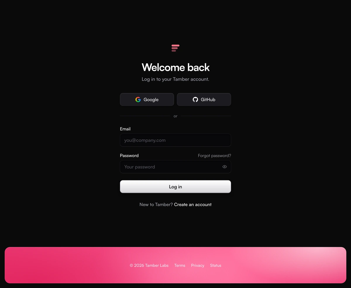
ProA login screen with almost nothing on it, and every piece finished. A small rose mark, Welcome back, Google and GitHub side by side, then email, password and a Log in button, all in one narrow column in the middle of a plain page. Along the bottom edge a rounded strip of bright rose holds the copyright and the legal links, which gives the screen its colour without putting anything behind the form. Errors, waiting and success are all handled for you.
What a simple login UI keeps, and what it drops
Login Page With Minimal Form is a React and Tailwind CSS login screen that asks for an email and a password on an otherwise empty page, in Next.js or any React app. There is no card around the form, no photograph and no remember me checkbox: the column sits directly on the page background, and the only decoration is the colour strip along the bottom.
Simple here means fewer decisions for the person signing in, not fewer states for you to build. The column is capped at 380px so fields stay a comfortable length on a wide monitor. Social buttons share one row instead of stacking, which saves a full button height and keeps the whole form within a single glance.
The rose strip is what separates this from a blank template. It is inset from the edges with an 18px radius, so it ends cleanly instead of fading into the page, and its colour travels from a deep rose in the lower left through hot pink to a soft blush in the upper right, with fine grain laid over it. Pass backdrop as false and it disappears, leaving a plain grey footer.
The login screen, piece by piece
One column, centered at every width, with 20px of page on each side on a phone. The page is at least as tall as the screen, never shorter than 860px (900px from 1024px up), and extra bottom padding keeps the form clear of the strip.
Mark
Three stacked bars of falling width, drawn inline in rose and linked to your home page with an accessible name built from brandName. There is no wordmark beside it; the brand name appears in the sign up line instead.
Welcome back
A 34px bold heading on desktop, 30px on phones, with one muted line under it. It is an h2 by default; pass headingAs h1 when the screen is the page.
Google and GitHub
Two raised buttons in a two column grid, each labelled with just the provider name and given a full Continue with label for screen readers. With one provider the button spans the column.
Email and password
Recessed fields with visible labels, a Forgot password link on the password row, an eye button to reveal what was typed and a Caps Lock note that appears only while it is on.
Log in
A graphite button in light mode and a silver one in dark mode, then New to Tamber? Create an account underneath, centered.
Footer strip
A rounded band 112px tall on phones and 124px from 640px up, holding the copyright and a Legal navigation of Terms, Privacy and Status in white. It keeps the same bright rose in both themes, so on white and on near black it is the one splash of colour on the page.
Is a simple login screen right for your app?
Use it when
- Most of your users sign in with Google or GitHub, and email and password is the fallback.
- You want the screen to feel calm and fast, with a single splash of colour rather than a picture or a card.
- Your product already has a pink or rose accent, or can live beside one.
- You do not need a remember me option, because sessions are long by default or handled elsewhere.
Skip it when
- Your brand colour clashes with rose and you would rather not recolour the strip. Turn it off, or pick the centered card layout.
- You need a keep me signed in checkbox. This form sends only the email and the password.
- Sign in happens with a one time code or a magic link. The password field cannot be switched off.
- You want to show the product, a testimonial or a photo on the sign in route. Use the split screen layout.
Hook the login screen up to your auth
The form calls onSignIn with the trimmed email and the password, and only after both pass its checks: the email must look like name@domain and the password must not be empty. While the promise runs the button says Logging in and the fields turn read only. On success it says Logged in, and if nothing navigates away within 2.4 seconds the password clears and the form is ready again. Throw an Error and its message appears in a red alert above the button, with the password selected for retyping.
onProviderSignIn gets google or github and should start your OAuth redirect. The pressed button spins and the other buttons dim until the promise settles or the page leaves. An error thrown here also lands in the alert, and with no message the screen names the provider it failed to reach.
One small behaviour is worth knowing: pressing Enter in the email field moves focus to the password field while the password is still empty, so people who type their email and press Enter are not told off for a missing password. The default handlers are demos that fail for any password under eight characters, so swap them out before you ship.
npx wensity@latest add login-page-with-minimal-form --type block
import { LoginPageMinimalForm } from "@/components/wensity/blocks/login-page-with-minimal-form";import { useRouter } from "next/navigation";import { authClient } from "@/lib/auth-client";export default function LoginPage() {const router = useRouter();return (<LoginPageMinimalFormheadingAs="h1"brandName="Acme"brandHref="/"description="Log in to your Acme account."signUpHref="/sign-up"forgotPasswordHref="/forgot-password"copyright="© 2026 Acme Inc."footerLinks={[{ label: "Terms", href: "/terms" },{ label: "Privacy", href: "/privacy" },{ label: "Status", href: "https://status.acme.com" },]}onSignIn={async ({ email, password }) => {const { error } = await authClient.signIn.email({ email, password });if (error) throw new Error("That email and password don't match.");router.push("/app");}}onProviderSignIn={(provider) => authClient.signIn.social({ provider })}/>);}
Props
| Prop | Type | Default | Description |
|---|---|---|---|
onSignIn | (values) => Promise<void> | void | - | Receives email and password once they validate. Throw an Error to show its message in the alert. |
onProviderSignIn | (provider) => Promise<void> | void | - | Called with google or github. Start your redirect here; the button spins meanwhile. |
backdrop | boolean | true | The rose footer strip. false gives a plain page with the footer in grey text. |
providers | ("google" | "github")[] | ["google", "github"] | Buttons shown above the form. An empty array removes them and the or divider. |
heading | string | "Welcome back" | The large line under the mark. description sets the muted sentence below it. |
brandName | string | "Tamber" | Used in the New to line and in the mark link's accessible name. |
footerLinks | { label; href }[] | Terms, Privacy, Status | Links inside the strip. copyright sets the text before them; empty values hide either. |
signUpHref | string | "#" | Where Create an account goes. forgotPasswordHref and brandHref follow the same pattern. |
Accessibility, motion and what it loads
No animation library
Tailwind classes and React state do all the work. @tabler/icons-react provides the eye, check and alert icons; the mark and GitHub logo are inline SVG and the Google logo loads from assets.wensity.com. The strip and its grain are CSS gradients and an inline SVG noise, with no image to download.
Errors tied to fields
Each error message is linked to its input through aria-describedby, and the input is marked aria-invalid. After the first submit the messages update with every keystroke, so they vanish as soon as the field is right.
Spoken progress
A polite live region announces Logging in, Logged in, or Connecting to Google or GitHub. Failures from your handler use role alert, so they are read out immediately.
Focus stays put
Buttons are made aria-disabled rather than disabled while a request runs, and the fields go read only, so focus is never thrown back to the top of the page. A failed submit focuses the first field that needs attention.
Password managers
The fields carry autocomplete email and current-password. The reveal button exposes aria-pressed and switches its label between Show password and Hide password.
Reduced motion and both themes
Under prefers-reduced-motion the spinner stops and colour transitions are turned off. Light and dark each give every surface an opaque colour, and the mark and focus rings use rose to match the strip in both.
Block details
- Category
- Login Pages
- Renders
- CSS only. Paints as soon as the stylesheet arrives
- Theme
- Follows the site theme in light and dark
- Dependencies
@tabler/icons-reactclsxtailwind-merge- Source
- 601 lines, 28 KB in one file
- Install
wensity add login-page-with-minimal-form --type block- Tags
- light, dark, login, sign in, form, auth, login screen, minimal
- Last updated