Sign Up Form with Password Strength Meter for React
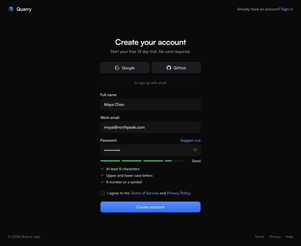
ProA create account page that coaches the password while it is being typed. A slim header carries your brand and a Sign in link; below it, one 400px column holds the heading, Google and GitHub buttons, then full name, work email and password fields. Under the password, four bars fill and change colour as the score climbs, a word names the level, and a three line checklist ticks itself off. Accepting the terms and pressing Create account swaps the form for a check your inbox screen with a timed Resend button.
What a password strength meter adds to a sign up page
Login Page With Password Strength Meter is a React and Tailwind CSS sign up form whose password field is scored live, with four bars, a strength label and a requirement checklist, in Next.js or any React app. It covers the whole create account route: header, social sign up, the form, a terms checkbox and the confirmation step after it.
The meter is there to stop a failed submit before it happens. Most signup pages reveal their password rules only after someone presses the button and gets an error. Here the rules are visible from the first frame, and every keystroke moves the bars a little, so the person can watch the password get stronger and knows exactly what is missing. The levels read Weak, Fair, Good and Strong, in red, amber and green.
Scoring is a plain function inside the file with no dependency. It rewards length first and the mix of lower case, upper case, digits and symbols second, and it drops any password to Weak when it contains a common choice such as password or qwerty, includes the person's name or the part of their email before the at sign, or uses fewer than five different characters. The form only submits at Good or better.
Parts of the signup page, top to bottom
The page is at least as tall as the screen, with a floor of 860px that rises to 940px from 1024px wide. From that width the form column is centered vertically; below it the column starts just under the header, so on a phone the heading sits near the top.
Header with a way back
The brand mark, a cut stone drawn as three shaded faces of blue in inline SVG, links home on the left. On the right, Already have an account? Sign in. Below 640px only the Sign in link stays, so the header never wraps.
Social sign up row
Google and GitHub as two raised buttons sharing one row, each labelled with just the provider name and announced as Sign up with Google or Sign up with GitHub. A rule reading or sign up with email separates them from the fields.
Three fields
Full name, Work email and Password, recessed into the page with a blue focus ring. The password row carries a Suggest one action on the right of its label and an eye button inside the field, plus a Caps Lock note when it applies.
The strength meter
Four bars that fill from the left, the level word beside them, a one sentence reason when the password is guessable, and the checklist: at least 8 characters, upper and lower case letters, a number or a symbol. Each line turns from grey to green with a tick.
Terms and submit
A required checkbox reading I agree to the Terms of Service and Privacy Policy, with both titles as links, then the Create account button: a blue fill with a lit top edge in both themes, one step darker on hover and darker again when pressed. Sign in, Suggest one and the legal links share the same blue.
Check your inbox
After a successful submit the column shows the address the link went to, a Resend email button that counts down 30 seconds before it can be used again, and Use a different email, which brings the form back with the email selected.
When this signup page is the right one
Use it when
- Your product creates accounts with an email and a password and confirms the address by email before the first sign in.
- Support keeps hearing from people whose password was rejected without a reason. The checklist tells them before they submit.
- You offer a free trial and want the page to ask for nothing beyond a name, an email and a password.
- Some of your audience signs up with Google or GitHub and the rest wants a classic form, and both should be one glance apart.
Skip it when
- Accounts are passwordless. A magic link or a one time code screen has no use for a strength meter.
- You need more than three fields, such as company size or role. Add them after sign up in onboarding, or extend the file.
- Your password policy is set by a compliance rule the local score does not model, such as a breached password lookup. Keep the meter as a guide and check on the server.
- Sign up happens inside a modal over a marketing page. The block paints its own page, header and footer.
Connect the sign up form to your backend
onSignUp receives name, email and password once every field has passed: a name is present, the email matches an address pattern, the password meets all three rules and scores Good or Strong, and the terms box is ticked. Name and email arrive trimmed. While your promise is pending the button reads Creating account and the fields become read only. Resolve it to show the inbox screen; throw an Error and its message appears in a red alert above the button, with the form left exactly as it was.
onResendEmail gets the email address when someone presses Resend email, and the button starts a fresh 30 second countdown after it succeeds. onProviderSignUp receives google or github and keeps that button spinning until it settles, which suits OAuth flows that redirect away.
Suggest one fills the password with sixteen random characters in four groups joined by dashes, drawn with crypto.getRandomValues from a set that leaves out look alike characters such as O, 0, I and 1, and always includes an upper case letter, a lower case letter and a digit. It also reveals the field so the person can see what they are saving. Turn it off with allowSuggestedPassword set to false if your password manager prompt should be the only suggestion.
npx wensity@latest add login-page-with-password-strength-meter --type block
import { LoginPagePasswordStrength } from "@/components/wensity/blocks/login-page-with-password-strength-meter";import { authClient } from "@/lib/auth-client";export default function SignUpPage() {return (<LoginPagePasswordStrengthheadingAs="h1"brandName="Acme"brandHref="/"heading="Create your Acme account"description="Free for 14 days, then pick a plan."signInHref="/sign-in"termsHref="/terms"privacyHref="/privacy"copyright="© 2026 Acme Inc."onSignUp={async ({ name, email, password }) => {const { error } = await authClient.signUp.email({ name, email, password });if (error) throw new Error(error.message ?? "We couldn't create that account.");}}onResendEmail={(email) => authClient.sendVerificationEmail({ email })}onProviderSignUp={(provider) => authClient.signIn.social({ provider })}/>);}
Props
| Prop | Type | Default | Description |
|---|---|---|---|
onSignUp | (values) => Promise<void> | void | - | Gets name, email and password after validation. Throw an Error, for example for a taken address, to show its message. |
onResendEmail | (email) => Promise<void> | void | - | Runs from the check your inbox screen. A throw shows its message under the button. |
onProviderSignUp | (provider) => Promise<void> | void | - | Called with google or github from the buttons above the form. |
providers | ("google" | "github")[] | ["google", "github"] | Two providers share a row, one fills it. An empty array drops the row and its divider. |
allowSuggestedPassword | boolean | true | Shows the Suggest one action beside the Password label. |
heading | string | "Create your account" | The page title. description sets the trial line under it. |
brandName | string | "Quarry" | Beside the mark in the header and in the inbox screen sentence. |
termsHref | string | "#" | Target of Terms of Service. privacyHref, signInHref and brandHref work the same way. |
Motion, accessibility and weight
Bars that move as you type
The fill is continuous: a short password grows the first bar character by character, and from Fair upward the next bar fills part of the way as the password grows longer. Bars ease over 460ms, colours blend, and a paste or a suggestion fills them left to right in a short stagger.
Reduced motion respected
With prefers-reduced-motion on, the bars jump straight to their width, the level word appears without sliding and the spinners hold still.
Strength you can hear
The level sits in a polite live region read as Password strength: Good, and each checklist line ends in hidden text saying done or not yet. The password input points at the meter, the checklist and any error through aria-describedby.
Focus goes where the problem is
A failed submit focuses the first field that needs attention, including the terms checkbox. On success, focus moves to the Check your inbox heading so a screen reader starts reading the new screen.
Password managers welcome
The fields use autocomplete name, email and new-password, so browsers offer to generate and save a password. The eye button reports its state with aria-pressed.
No motion library
Tailwind classes and React state only, with one keyframe in a plain style tag for the label. The single package is @tabler/icons-react for the eye, check and alert icons.
Block details
- Category
- Login Pages
- Renders
- CSS only. Paints as soon as the stylesheet arrives
- Theme
- Follows the site theme in light and dark
- Dependencies
@tabler/icons-reactclsxtailwind-merge- Source
- 964 lines, 43 KB in one file
- Install
wensity add login-page-with-password-strength-meter --type block- Tags
- light, dark, sign up, register, form, auth, password strength meter, password strength indicator
- Last updated